10+ Principles of a Powerful Game UI: Quick Guide
- Taisiia Dobrozorova

- Jan 10, 2024
- 6 min read
Game UI is one of the most important parts of game development, which is directly related to game design, but partially falls outside its area of competence.

Let's take game interfaces in a broad, global sense, and consider their direct relationship with the game itself. We can say that: the game and the player live in completely different universes, separately from each other, and it is the interface that is the point of their mutual contact. Through the interface, the player receives information from the game, and the game accepts the player’s desires and mood.
Therefore, the quality of this communication depends on the quality of the UI. Thus, the game designer must understand the issue, because interfaces represent the game mechanics he has developed and in the work process he has to work closely with the artist, or interface designer.
Game UI: where to start?
So, there are two news: good and bad.
The bad news is that there is no textbook, guide, or clear unambiguous list of rules to help you create the ideal interface for your game. There is no universal description by which you can create an inventory or character window in any game. Like creating the game itself, creating interfaces is an individual and creative process.
The good news is that despite this, some principles can guide you when creating a game interface to avoid making common blunders.
Psychological principles of game UI development
These are general principles related to how the human brain and eye perceive information. They are associated with our habits and ways of processing information developed over the years.
1. Gaze movement
When reading, information is located from left to right, from top to bottom - this is how our eyes move. There is an opinion that when developing an interface, you should follow this rule: place the most important elements on a diagonal from the upper left to the lower right.

2. First the picture, then the text
Any person first pays attention to the image, and only then to the text that accompanies it, because... First, our brain visually perceives bright visual images, which are images, and then, having drawn the maximum amount of information from there and feeling that it is not enough, it is accepted as text.

3. Groups of objects
A person does not perceive a large amount of data well, and he assimilates entities divided into groups much better. As in writing design documentation, where it is important to present information in blocks and lists. So, in presenting visual information it is important to group it so that the user goes from the general to the specific. Also, interface elements need to be grouped according to a common feature or task that they perform.

4. Familiar elements
In any type of interface, there are axiomatic elements that are well-established and accepted by humanity. This does not mean that all these interfaces should be similar to each other.
However, when faced with an unfamiliar and new interface, a person will try to cling to a familiar and understandable principle of information arrangement or a familiar element. For example, most RPG inventories have a similar structure, and the call symbol is an icon of a telephone handset (even though no one has been using handsets of this shape for a long time).
For more information, you can google Jacob's Law.
5. The amount of information a person can absorb
When a user encounters a new interface, he has to absorb a huge amount of information, learn about many new functions, and learn how to use them. The volume of the new things is directly proportional to the horror that grips a person. Complex and multifunctional screens need to be broken down into simple ones, without trying to cram all the information into one place.
This rule is also one of those that works not only for the interface: in the same way, you need to consistently introduce new mechanics into the game so that the player does not escape due to the complexity of your gameplay.
For more information, you can google Hick's Law.

Fundamental principles of interface design
These are principles that concern not the psychological component of the interface, but its logical structure. Logic in building interfaces goes hand in hand with the psychology of the human brain. In the previous paragraph we looked at how it should be, and in this one let's formulate errors that should not happen.
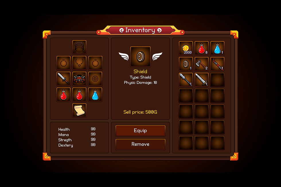
1. A few elements on one game screen
Very often you can find interfaces in which the scale of the accumulation of buttons, images, progress bars, and checkboxes is simply uncountable. This happens because the developer does not fully understand the key task of the player in this interface; it seems to him that absolutely all these elements are needed to interact with this aspect of the game.
Pay attention to the balance in both halves of the interface. Even though the left half is extremely functional due to the large number of slots, it does not outweigh the right, since it is made the same in terms of filling and shape, and this is just a button to go to another interface, and the Raw bones counter. It was possible to fit the crafting of amulets into this window, but just imagine how overloaded it would be with functionality.

2. Uniformity of elements
This is a mistake that is quite easy to make. It arises because the game designer works on each window separately, not realizing that in fact, the interface is a single system presented to the player in parts and also can be reused.
For example, if you decide to add such and such a progress bar, or such and such a button in shape and size, be prepared for the fact that they will have to be used in the future. And if it turns out that “oh, but it doesn’t fit here,” or “oh, but it doesn’t look right here,” you won’t be able to simply draw new progress bars for a specific window, or new buttons. This will lead to the fact that the player will not feel comfortable in any of your interfaces.

The solution is to use similar visualization: similar tiles, headers, lists, highlighting of selected items, Back and Exit buttons, etc. Once from the loading interface to the tutorials interface, the player will immediately understand what he needs to do and where to look.

5. Beauty vs. convenience
Very often you can see interfaces in which there is a lot of art, monograms around elements, diamonds, jewelry, and other tinsel. Of course, when the game itself is so bright, we want to make the interface not faceless, but artistic and atmospheric.
In pursuit of beauty, a game designer often forgets about ergonomics, and all this heap of beauty not only blurs the player’s very concept of the purpose of this interface but also steals space from truly functionally important elements. In addition, do not forget that each of them is an additional GB to the total weight of your game.

6. Place accents
This problem occurs when there are no accents on the screen, or when, on the contrary, there are so many of them that nothing specific stands out to the eye. Emphasis is the highlighting of interface elements with color, animation, or size. Remember your school notes, where (well, at least at the very beginning of the year) you highlighted important things with a green pen, underlined definitions, and wrote NB! on the fields?
So, the game interface also needs its own “notes” to concentrate the player’s attention on what is important in each interface. In addition, the game is a constantly changing and dynamic structure. Its rules change, new opportunities appear, and old ones disappear. All this needs to be brought to the attention of the player immediately.

Conclusion
Designing interfaces is a complex task that requires the ability to look at the problem holistically and make any decisions very thoughtfully. In this article, we looked at the psychological aspect of how a player unconsciously perceives information, as well as the universal laws of interface design that make it convenient.
Create a game with HitBerry Games
HitBerry Games is a mobile app development studio that has deep expertise and prolonged experience in mobile games development as well as game design. Our mobile games development studio brings together high-skilled and dedicated game developers and designers ready to bring your ideas to life.
We provide advanced mobile games outsourcing development to enhance your in-house team as well as full-cycle mobile games development services for enterprises and start-ups.
In terms of each project, we use cutting-edge technology and agile methods and apply creative vision to deliver eye-catching games that will hit the target.
Contact us now and share your ideas!


